Разбираю презентацию в формате 3 плюса, 3 минуса.
Три плюса
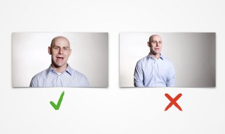
1) Коротко и отрепетированно — ну либо это очень хороший монтаж. Если смотреть на скорости, то даже прямо бойко.
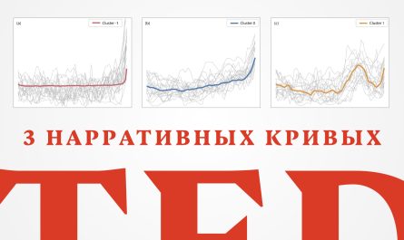
2) Структура мотивирующего жанра соблюдена — есть проблема, есть решение, есть призыв к действию. Нет ненужного сторителлинга. Ну и в решении мне понравилось, как выстроили перепитии: про плюсы, которые поднимаются повыше, если рядом цифры; про цифры, которые одной ширины, чтобы этикетки не менять. Очень правильные акценты выбраны.
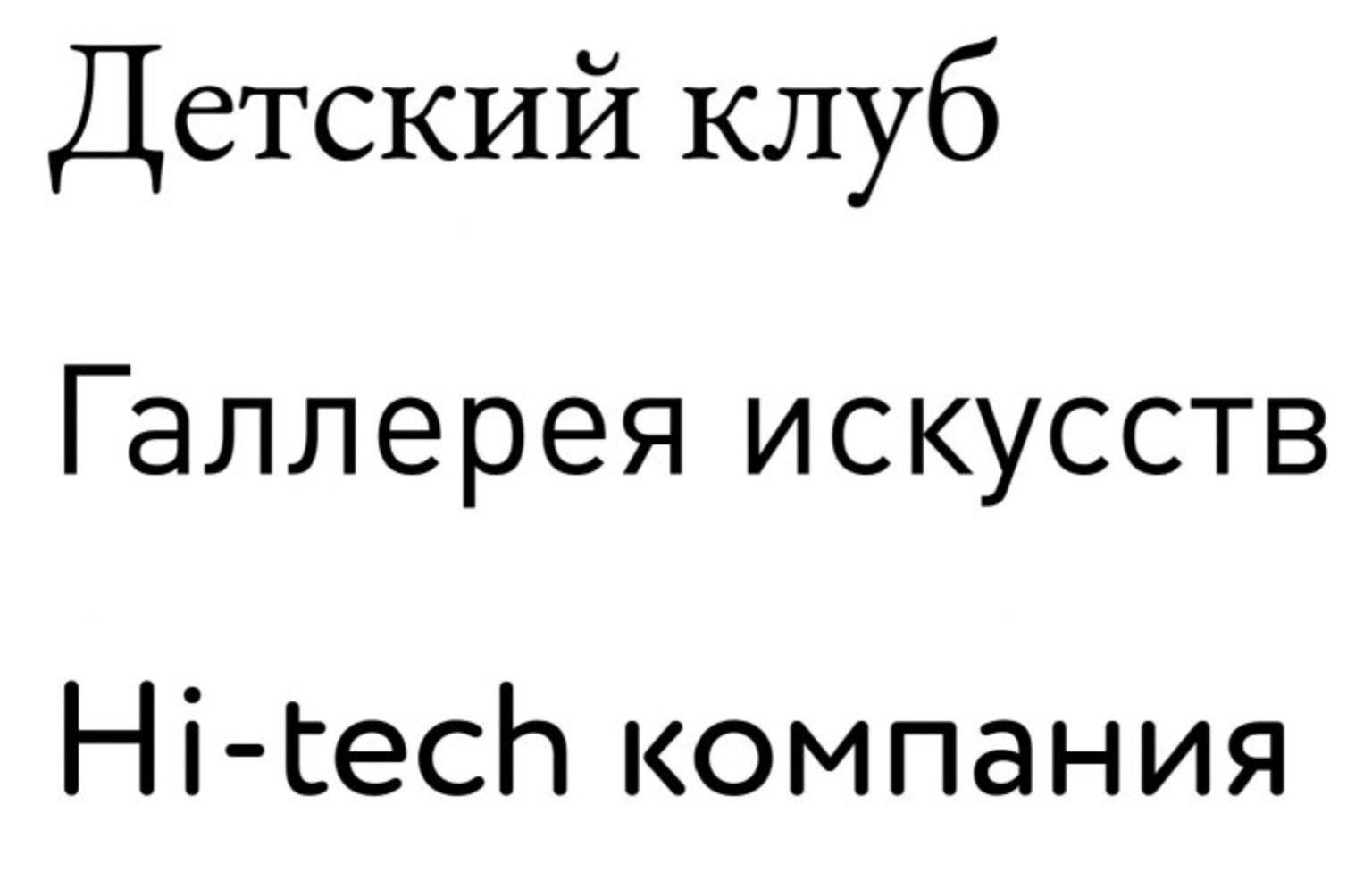
3) Факапы с не подключившимся шрифтом Ярослав отлично утилизировал. Вообще это выглядело как запланированная шутка. Не знаю, что это было на самом деле, но в обоих случаях — хорошо.
Три минуса
1) Нет ничего про деньги — шрифты, это в первую очередь про деньги. В среднем в год, нам шрифты обходятся в 50 тысяч долларов на лицензии. Разработка на заказ обойдется в 100 тысяч долларов, но это разовая сумма. Т.е. каждый следующий год нам не надо будет ни платить за лицензии, ни иметь проблем с тремя разными наборам шрифтов.
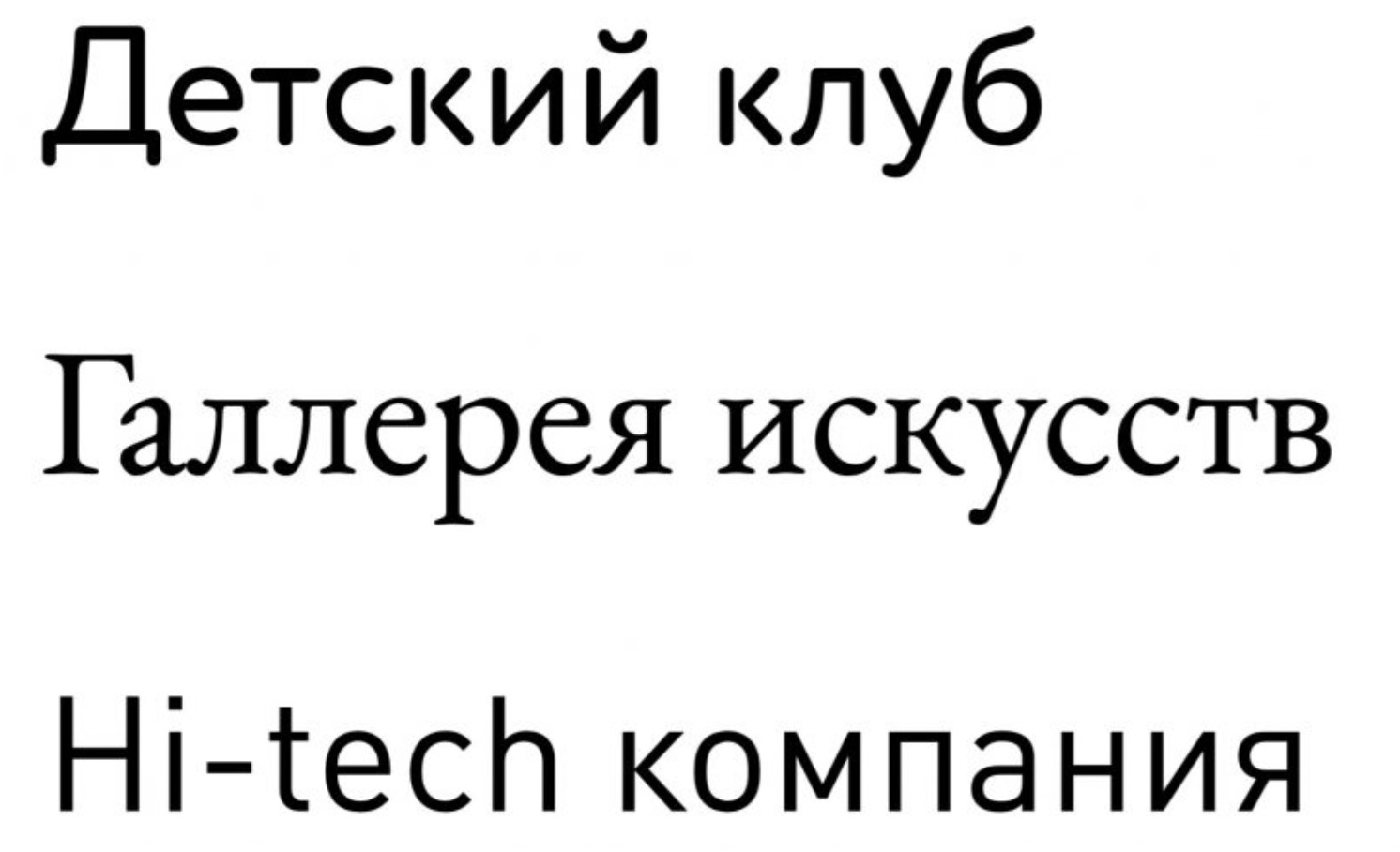
2) В начале проблематизации простые примеры с ауди и мерседе. Шрифты показывались с оригинальными текстами и версткой постеров.Слишком много вторичных подсказок. Так их отгадает большая часть автомобилистов. Т.е. если была попытка показать, что «вы все разбираетесь в шрифтах, даже если вы не дизайнер», то она больше походила на «вы все умеет отличать плакат аудит от плакат мерседес». Возможно примеры стоило усложнить — например, только надписи одной и той же фразы шрифтами разных брендов.


3) Не хватило метрик — как мерили, что шрифт работает лучше или как минимум не хуже. Типа A/B-тест одной и той же страницы с разными шрифтами. Вот Амазон при разработке нового шрифта для Kindle хотел, чтобы читаемость стала лучше. И они специально для этого проводили внутренние тесты: старый шрифт Caecilia против нового Bookerly — утомляемость меньше на 2%
—— In English ——
A review of the “New DODO Typeface” presentation
I review presentation using the next format: 3 good things, 3 things to improve and how.
3 good things
1) Short and well-rehearsed — or it is just a good editor’s cut. If you try watching it on double speed it may look rather energetic and well paced.
2) The structure is complete — there is a short intro, problem, solution and call-to-action. No pointless storytelling. Well, in the solution I liked the way they lined up the twists and turns: about the plus sign, which goes up higher if the numbers are next to each other; about the numbers being the same width, so you don’t have to change the whole labels. The accents are just right.
3) The fuck-ups with the font not installed in were perfectly handled by Yaroslav. Generally it looked like a well-planned joke. I don’t know if it was actually a joke, but in both cases it was good.
3 things to improve
1) There is nothing about money – typefaces are primarily about money. On average, typefaces cost us $50,000 a year for licences. A custom typeface would cost $100,000, but that’s a one-off sum. This means that every year thereafter we would neither have to pay for licenses nor have the problem with three different sets of typefaces.
2) In the beginning, too easy-guessed examples with Audi and Mercedes. The typefaces were shown with the original texts and layout of the posters.Too many secondary clues. So they will be easily guessed by most private car-owners. If there was an attempt to show that “you all are good at typefaces, even if you are not a designer”, it was more like “you all are capable to distinguish an audi poster from mercedes”. Perhaps the examples should have been more complicated – for example, just the same phrase using different brands typefaces

try to guess which typeface whould you use to type each of this phrases

3) Not enough metrics – how do you measure that a font performs better or at least not worse. Like an A/B test of the same page with different typefaces. For example, Amazon, when they developed a new font for the Kindle, wanted a better legibility. And they did internal tests specifically for that: the old Caecilia font versus the new Bookerly – fatigue was 2% lower