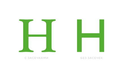

Кажется, еще один миф рушится, а именно «Шрифты с засечками лучше читаются». Увы, кажется, что нет. Исследования этого не подтверждают. Оба класса шрифтов при прочих равных читаются приблизительно одинаково.
Но вот, какой эпизод этого балета мне просто взорвал мозг: аж с 80-х учителя заявляли, что детям понятнее азбуки в шрифтах БЕЗ засечек (уже начинаете смеяться?) Т.е. взрослым лучше заходят засечки, а вот детям без засечек. Это как?! Ну ладно, я пошел яндекснул «азбука» — на каждые 20 картинок алфавита в шрифтах без засечек приходится лишь 5 алфавитов в засечках (т.е. этот миф живет до сих пор). Но вся прелесть в том, что сами дети об этом своем предпочтении не знают — в тестах они одинаково воспринимают азбуки с засечками и без. (1)
Источники:
- http://alexpoole.info/blog/which-are-more-legible-serif-or-sans-serif-typefaces/
- https://geniusee.com/single-blog/font-readability-research-famous-designers-vs-scientists
- https://www.researchgate.net/publication/7661546_Serifs_and_font_legibility
- https://www.ncbi.nlm.nih.gov/pmc/articles/PMC4612630/