In a class I attended on formulating a personal code of values [yep, a corporate values consultant takes a course on values], I had to recall real and fictional characters that I liked adn why. One of them was Nicolas Jenson (1420-1480), a typeface designer and publisher who created the famously sought-after Jenson typeface. The typeface had many interesting details that his contemporaries had not thought or dared to do. For example, he re-invented the letter h as we know it today.
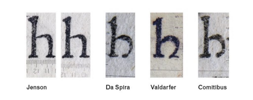
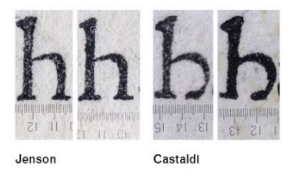
Before Jenson, there were already many typefaces «on the market» and in all of them the letter h was drawn with a rounded right foot (see 3 samples to the right). The disadvantage of this form is that at small size and with a low level of printing, this form started to look a lot like a small b (especially Da Spira). Seeing such a «bad design,» Jenson, designed his own version of the letter h1
Yes, it was a risk that nobody would buy his typefaces. There is evidence, that a publisher Panfilo Castaldi, who bought Jenson’s typeface, replaced the letter h with his own version1
That’s what I call innovation (a mixture of evolution, courage and entrepreneurship, if you like). The man found a problem, proposed a solution and, most importantly, was not afraid to start selling it, knowing that he could get rejection from his audience. He made a bet and put in the effort to make it play. It was a kind of challenge from the future: «Name some important truth that people around you disagree with for the most part?» He named his letter h.
Sources:
- https://articles.c-a-s-t.com/nicolas-jenson-and-the-success-of-his-roman-type-9f0afeba4103
Инноватор Николя Жансон
На курсе по формулированию личного кодекса ценностей [ага, консультант по корпоративным ценностям проходит курс по ценностям] я вспоминал реальных и вымышленных персонажей, которые мне нравятся. Одним из них был Николя Жансон (Nicolas Jenson, 1420-1480), дизайнер шрифтов и издатель, который известен тем, что создал востребованный шрифт Jenson. В шрифте было много интересных деталей, на которые его современники не осмелились или не догадались. Одна из таких деталей — он перепридумал букву h так, как нам она известна сегодня
До Жансона уже было много шрифтов «на рынке» и во всех буква h рисовалась с закруглением правой ноги (см. 3 образца справа). Недостаток этой формы в том, что при мелком размере и/или при плохой печати эта форма начинала сильно походить на маленькую букву b (особенно Da Spira). Видя такой «bad design», Жансон, нарисовал свою версию буквы h1
Да, это был риск, что его шрифт не стали бы покупать. Найден даже один пример, когда издатель Panfilo Castaldi, купивший шрифт Жансона, заменял букву h на свою версию1
Вот это я называю инновацией (этакая смесь развития, мужества и предпринимательства, если хотите). Человек нашел проблему, предложил решение и, главное, не побоялся начать это продавать, осознавая, что может получать отказ от аудитории. Он сделал ставку и приложил усилия, чтобы она сыграла. Это был своего рода вызов из будущего: «Назовите какую-нибудь важную истину, с которой люди, окружающие вас, по большей части не согласны?» Он назвал свою букву h.
Sources:
- https://articles.c-a-s-t.com/nicolas-jenson-and-the-success-of-his-roman-type-9f0afeba4103